

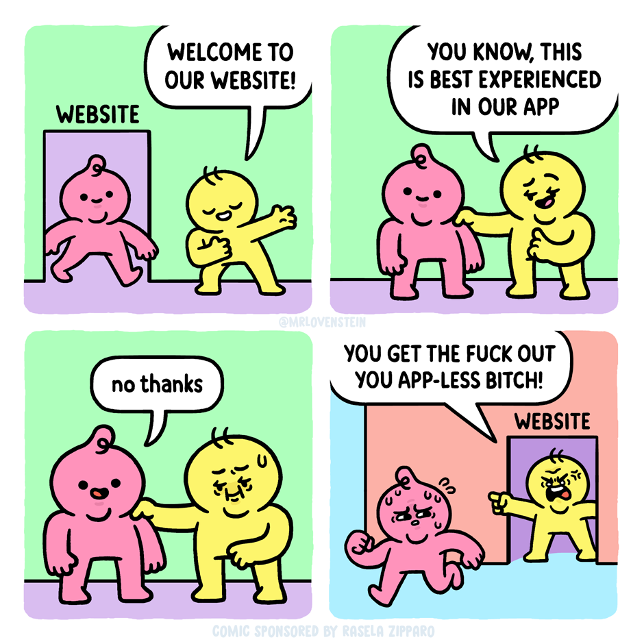
cross-posted from: https://piefed.social/c/mrlovenstein/p/1386847/apprehension
cross-posted from: https://crust.piefed.social/c/comicstrips@lemmy.world/p/58758/apprehension
cross-posted from: https://piefed.social/c/mrlovenstein/p/1386847/apprehension
cross-posted from: https://crust.piefed.social/c/comicstrips@lemmy.world/p/58758/apprehension
Okay, I know I know that 99.9% of humans own a mobile phone, and the percentage that own a computer is much lower, but I’ve always hated how websites (first noticed with Google Search and Facebook) stopped caring about rendering for desktops and just utilised 30% of the screen width. Half the internet is a skinny portrait mode on a landscape screen and has been for ages
It’s skinny so that they can stuff the sides full of ads.
I have trouble reading across wide screens, though, is that just me?
On desktop you can change window sizes to what you want. Don’t like wide text? Use part of the screen. But the inverse is not true: if a site decides to stay skinny you can’t make it wide if that’s what you prefer.
This is why I miss square screens. And I miss proper UI/UX design which makes good use of screen real estate.
Omg, same, so same. But putting anything I need to read (like… anything in a browser usually) in a smaller window is fine. Librewolf letterboxing kinda does it for me.
You don’t actually have to maximise your windows, you can just set them to your favourite ratio.
Not just you. For more than a quarter century, we’ve known that if a paragraph’s text lines sprawl across a wide screen, it’s more difficult for most people to read. (And the same is true if the lines are too short. There’s an optimal range.)
https://jamesmattison.co.uk/method/why-line-length-matters-for-legibility/
For this reason, it’s good for a website’s style rules to limit how wide (measured in characters) a column of text can get, regardless of how much screen there is to expand into.
Thankies!
If you don’t want to change the window size for whatever reason, I find that reader mode (F9) solves this problem pretty well.
Fucking Instagram and their Web interface. Try to get the maximum video size on a horizontal screen. Bonus points when a horizontal video is uploaded to their vertical frame optimised viewer.
I did the math before: it was literally less than 1% of my screen. There’s no full screen feature.
Not like it cost them even a measurable amount of money to have one developed. They keep it awful intentionally to get you to install the app. Fuck companies like that.
Pretty sure narrow text width has been a thing for ages, even before smartphones. Unless you mean a newer, narrower style I guess. It’s easier to read when you can see both ends of a line at the same time so even letters are written on portrait paper.
And I’m not a web developer, but if I had to guess styling a page to limit the text width on a wide screen probably takes more effort, not less.
Yeah, good legibility is around 50-75 characters per line.
Yeah I mean, these are fine:
But anything thinner is just a waste, such as:
As for web dev, no doubt some situations would be more complex than others, but usually it’s as easy as saying “if the screen is x wide, render like a, otherwise render like b.”
There’s one reason I don’t use LibreOffice word processor on Linux, and that’s because it uses a mobile scrollbar, which is incredibly frustrating if your doc is more than a few pages, and completely unusable with, say, a multi chapter story. Just released a major UI update, still unusable, because they won’t put buttons on their fucking scrollbar in app literally designed around scrolling. Fuck you, Libre.
I hope Calligra, Collabora, CryptPad, NextCloud Office, OnlyOffice (uses Microsoft formats -_-) or OpenOffice (LibreOffice’s origin, reportedly even worse/older UI) are suitable alternatives! Note that not all of them have apps on mobile in case you value cross-platform usage, and NextCloud and CryptPad are web-based only. Other than that all are great on Linux.
I use OpenOffice. The UI seems fine, to me. Plus they had the Header navigation panel before Libre, which is handy for jumping between chapters.
And they’re not worried about taking that extra 5 precious pixels off the side of a desktop application to scroll with. Not sure how they’ve managed to spare that space, but the devs are obviously Tetris prodigies or something.
So the 30 characters wide texts are a thing? And here i always thought that was a issue with one of my userstyles.
I hate how Desktop UI in general has been moving towards Mobile design for the last decade.
Everything has to always look like the latest shit from silicon valley, I despise it.
Imo all the work that was put into UI design for the last 20 years has been wasted effort.
I still use GNUStep and OpenMotif based Desktops because I genuinely think that those are better designed, and they haven’t been touched in forever.